
Hello Friends, Today i am going to teach you how to Create Animated Progress Bar by using HTML and CSS3. For this you must have the knowledge of HTML and CSS. we can also say this as Progress Bar, HTML Progress Bar, CSS Progress Bar.

So, lets start creating our progress bar.
Step 1
Create a html file and write down the following code in your html file and name it index.html.
<!DOCTYPE html PUBLIC "-//W3C//DTD XHTML 1.0 Transitional//EN" "http://www.w3.org/TR/xhtml1/DTD/xhtml1-transitional.dtd">
<html xmlns="http://www.w3.org/1999/xhtml">
<head>
<meta http-equiv="Content-Type" content="text/html; charset=utf-8" />
<title>Animated Progress Bar</title>
  <link rel="stylesheet" href="style.css">
</head>
<body>
  <section class="container">
    <input type="radio" class="radio" name="progress" value="five" id="five">
    <label for="five" class="label">5%</label>

    <input type="radio" class="radio" name="progress" value="twentyfive" id="twentyfive" checked>
    <label for="twentyfive" class="label">25%</label>

    <input type="radio" class="radio" name="progress" value="fifty" id="fifty">
    <label for="fifty" class="label">50%</label>

    <input type="radio" class="radio" name="progress" value="seventyfive" id="seventyfive">
    <label for="seventyfive" class="label">75%</label>

    <input type="radio" class="radio" name="progress" value="onehundred" id="onehundred">
    <label for="onehundred" class="label">100%</label>

    <div class="progress">
      <div class="progress-bar"></div>
    </div>
  </section>

</body>
</html>
As you can see i have added a line in head section which indicates that i have added a CSS file in our page.
<link rel="stylesheet" href="style.css">
Step 2
Now create a style.css file in your folder and add the following code in style.css file
body {
  font: 13px/20px 'Lucida Grande', Tahoma, Verdana, sans-serif;
  color: #404040;
  background: #333333 0 0 repeat;
}

.container {
  margin: 80px auto;
  width: 640px;
  text-align: center;
}
.container .progress {
  margin: 0 auto;
  width: 400px;
}

.progress {
  padding: 4px;
  background: rgba(0, 0, 0, 0.25);
  border-radius: 6px;
  -webkit-box-shadow: inset 0 1px 2px rgba(0, 0, 0, 0.25), 0 1px rgba(255, 255, 255, 0.08);
  box-shadow: inset 0 1px 2px rgba(0, 0, 0, 0.25), 0 1px rgba(255, 255, 255, 0.08);
}

.progress-bar {
  position: relative;
  height: 16px;
  border-radius: 4px;
  -webkit-transition: 0.4s linear;
  -moz-transition: 0.4s linear;
  -o-transition: 0.4s linear;
  transition: 0.4s linear;
  -webkit-transition-property: width, background-color;
  -moz-transition-property: width, background-color;
  -o-transition-property: width, background-color;
  transition-property: width, background-color;
  -webkit-box-shadow: 0 0 1px 1px rgba(0, 0, 0, 0.25), inset 0 1px rgba(255, 255, 255, 0.1);
  box-shadow: 0 0 1px 1px rgba(0, 0, 0, 0.25), inset 0 1px rgba(255, 255, 255, 0.1);
}
.progress-bar:before, .progress-bar:after {
  content: '';
  position: absolute;
  top: 0;
  left: 0;
  right: 0;
}
.progress-bar:before {
  bottom: 0;
  border-radius: 4px 4px 0 0;
}
.progress-bar:after {
  z-index: 2;
  bottom: 45%;
  border-radius: 4px;
  background-image: -webkit-linear-gradient(top, rgba(255, 255, 255, 0.3), rgba(255, 255, 255, 0.05));
  background-image: -moz-linear-gradient(top, rgba(255, 255, 255, 0.3), rgba(255, 255, 255, 0.05));
  background-image: -o-linear-gradient(top, rgba(255, 255, 255, 0.3), rgba(255, 255, 255, 0.05));
  background-image: linear-gradient(to bottom, rgba(255, 255, 255, 0.3), rgba(255, 255, 255, 0.05));
}

#five:checked ~ .progress > .progress-bar {
  width: 5%;
  background-color: #f63a0f;
}

#twentyfive:checked ~ .progress > .progress-bar {
  width: 25%;
  background-color: #f27011;
}

#fifty:checked ~ .progress > .progress-bar {
  width: 50%;
  background-color: #f2b01e;
}

#seventyfive:checked ~ .progress > .progress-bar {
  width: 75%;
  background-color: #f2d31b;
}

#onehundred:checked ~ .progress > .progress-bar {
  width: 100%;
  background-color: #86e01e;
}

.radio {
  display: none;
}

.label {
  display: inline-block;
  margin: 0 5px 20px;
  padding: 3px 8px;
  color: #aaa;
  text-shadow: 0 1px black;
  border-radius: 3px;
  cursor: pointer;
}
.radio:checked + .label {
  color: white;
  background: rgba(0, 0, 0, 0.25);
}
Now your file is ready and you can use it wherever you want.
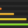
Here is the output result of your progress bar.
Progress Bar at 5%.

Progress Bar at 25%.

Progress Bar at 50%.

Progress Bar at 75%.

Progress Bar at 100%.

You can change the colour, design and layout of your Progress Bar by editing in CSS file.
Thank You

[url=http://www.official-mkoutlet.cc/][b]michael kors outlet online[/b][/url]
[url=http://www.coach-factory-outlet.xyz/][b]coach outlet online[/b][/url]
[url=http://www.oakleyoutlet-sale.net/][b]oakley sunglasses outlet[/b][/url]
[url=http://rayban-sunglasses.joanhedman.com][b]ray ban outlet[/b][/url]